

Cludo Dashboard Widgets
Making AI-powered search data clear and actionable through intuitive dashboard widgets.
Year
2023
Client
Cludo
Scope
Wireframing, Competitor Analysis, User Research, User Testing, Prototyping
Tools
Figma, Notion
About
Cludo provides AI-powered search solutions that help businesses optimize how users find and engage with digital content. Within the MyCludo dashboard, customers access analytics and insights based on search behavior across their websites.
Challenge
The dashboard needed new widgets that were both user-friendly and capable of reflecting emerging data patterns.
The goal was to design components that presented complex analytics in a clear, accessible way - helping teams act on insights without getting lost in the data.
Process
Research
The project kicked off with doing market research, to see how the competitors display their data. Conducting the competitor analysis provided me with valuable insights, into how and what kind of data the other businesses display in their analytics dashboard. I was able to understand better and identify Cludo's strengths and weaknesses relative to each competitor.
Later on, I proceeded to discover the requested features from the customers. One of the most requested features was discovering the journey of the user fx. to see from where users start their search and where they end up.
Since Cludo has already established a design library, creating the new widgets was not time-consuming.
The tricky part was to come up with a design which would display the data in the most user-friendly way so it's not only the dry numbers but valuable analytics which can be connected to actionable recommendations.

Design
Together with the Lead UI Designer, we developed six interactive widgets, validated through extensive internal and external usability testing.
User Testing
After the first round of user testing, I synthesised the findings on a Miro board to highlight key patterns. The insights revealed which elements supported task completion, where users faced friction, and which features required refinement.
These observations guided adjustments in wording, interaction design, and onboarding flow, ultimately strengthening the prototypes and contributing to the positive reception from stakeholders.
The Solution
Each widget provides flexible viewing options, allowing users to choose from 1, 2, 3, or 4 columns. This feature enables users to customize their dashboard layout according to their individual preferences and workflow needs.
Such adaptability not only enhances user experience but also ensures an optimal and convenient display on a wide range of devices, including desktops, laptops, tablets, and mobile phones.
As a result, the solution offers improved scalability and usability, accommodating various screen sizes and usage environments seamlessly.

The new widgets are designed to provide an instant overview of critical data:
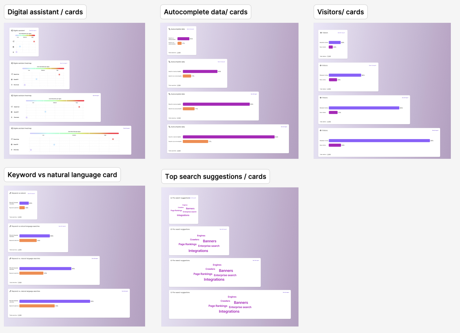
Ensuring a smooth user flow and data consistency.
Visual elements, including bar charts, word clouds, and scaled heatmap graphs, display the most relevant data directly on the dashboard.
Each widget has an extended version in the full report, offering users access to more detailed information.
For example, widgets with bar charts feature more detailed line or bar charts in the full report, allowing users to delve deeper into the data by hovering over or clicking on specific elements.
Keep reading!

Designing for Trust in Dating Apps
UX Research · Algorithmic Trust · Data Privacy · Inclusive Design · User Agency

Immersive Teaching Platform
Playful Learning · Prototyping · UX Research · Accessibility · Digital Platform

Redesigning Danish Health App (MinSP)
Healthcare UX · Notifications · Wayfinding · Patient Engagement · Service Redesign