

It’s a Match - Investigating UX & Trust in Dating Apps
Industry
Software / Entertainment
UX research + design proposal focused on improving user agency and transparency in algorithm-driven dating platforms.
Year
2024
Type
Student Project
Timeline
4 months
About
“It’s a Match” is a UX research project developed as part of my Master’s thesis, focused on understanding how users experience and trust algorithm-driven dating apps. The problem space centered on issues of bias, user agency, and lack of transparency in matchmaking algorithms.
Through a combination of surveys, interviews, and thematic analysis, I uncovered user concerns around fairness, control, and emotional safety. Building on these insights, I proposed a conceptual design solution aimed at fostering respectful behavior and increasing trust during onboarding. This project showcases my ability to work with complex, real-world topics and translate research into actionable, user-centered design ideas.
Challenge
Modern dating apps rely heavily on algorithmic matchmaking, yet most users have limited visibility into how these algorithms work - or how much control they truly have over their experience. Through my thesis, I set out to explore how UX design contributes to (or undermines) user trust, agency, and emotional safety in dating platforms. The problem wasn’t just technical; it was human. I wanted to understand:
How do users feel about algorithmic decisions in dating apps, and how can design make those interactions more transparent, respectful, and empowering?
The Process:
To investigate this, I conducted a mixed-method study that combined:
A user survey (n=130) to gather quantitative insights on app usage patterns, emotional experiences, and perceptions of control,
Qualitative interviews (n=5) that explored users’ real-life dating journeys, frustrations, and expectations,
Thematic analysis to identify key patterns and pain points.

Key insights included:
One of the survey questions
#1
Users often felt misled or confused by algorithmic decisions.

#2
There was a desire for more control and transparency in profile visibility and match selection.

#3
People wanted respectful and emotionally safer interactions, especially during onboarding and messaging.
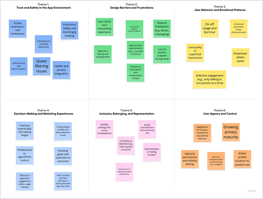
Miro Board / Thematic Analysis based on survey & interviews dataMiro Board / Thematic Analysis based on survey & interviews dataPublished survey
Survey Respondent’s Quote
“The algorithm is designed for you to need to constantly come back… it does not support you in finding your future partner.”
Survey Respondent’s Quote
“If they resolve the issue of data sharing or privacy concerns, it will be a great value addition to these dating apps. [...] Make it more encrypted and personalised.”
The Solution:
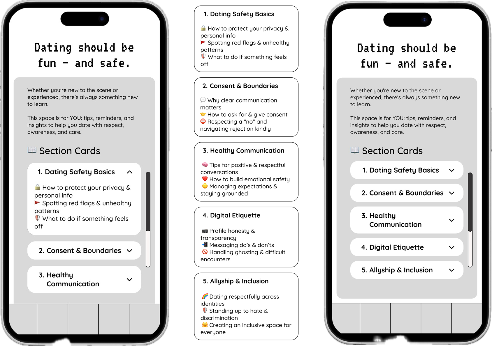
Based on these findings, I proposed a conceptual onboarding flow designed to build trust from the start.
It included:
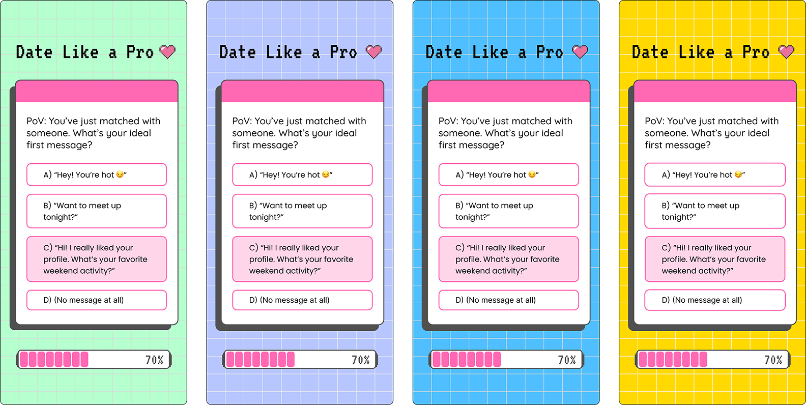
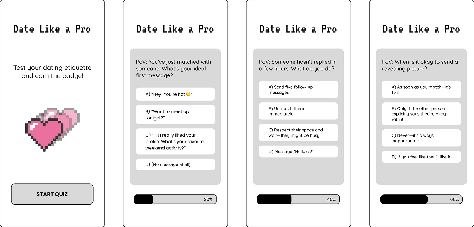
A short, interactive quiz introducing users to community values (e.g., kindness, no hate speech, no unsolicited images)
Design elements that set behavioral expectations and affirm user agency
Subtle affordances to guide respectful interactions without overwhelming the user experience
Moodboard
In the second deliverable (high-fidelity prototype), I applied a vibrant color palette and graphics inspired by the project’s moodboard. Since research indicated that the target audience of dating apps is predominantly aged 18–35, the design leans into aesthetics that resonate with Millennials and Gen Z - evoking a sense of nostalgia while keeping interactions playful and engaging.
The interface integrates elements such as a progress bar for clear orientation and a highlighted selection state to provide immediate feedback. This combination ensures the experience feels intuitive, rewarding, and consistent with familiar app patterns.
The moodboard for the dating app concept draws heavily from the vibrant and nostalgic 90's pixelated aesthetic, combining bold colors and pixel-art elements to evoke a retro digital atmosphere.
Sharp, blocky pixel graphics and chunky typography create a playful yet straightforward visual language, reminiscent of early computer interfaces and video games. The color palette features saturated hues like electric blues, neon pinks, and bright yellows, enhancing the energetic and fun vibe.
This design choice not only taps into the growing trend of retro nostalgia but also imbues the app with a friendly, approachable personality that stands out in a crowded market.
Overall, the moodboard balances vintage tech charm with modern usability, crafting a unique and engaging user experience rooted in the spirit of the 90s digital era.
2nd Deliverable: High-fidelity wireframes - prototypeWhile I did not fully prototype the entire app, I designed key screens to visualise how research insights could inform real UX decisions.
This concept demonstrates how design can act as a bridge between complex algorithmic systems and human values like trust, safety, and self-expression.

1st Deliverable: Low-fidelity wireframes


Keep reading!

Redesigning Danish Health App (MinSP)
Healthcare UX · Notifications · Wayfinding · Patient Engagement · Service Redesign

Immersive Teaching Platform
Playful Learning · Prototyping · UX Research · Accessibility · Digital Platform

Cludo Dashboard Widgets (SaaS)
Dashboard Design · Data Visualization · Widget Design · SaaS · Accessibility